

Responsive Angular Views using defer block
Often, our Angular applications face the challenge of creating responsive applications or websites based on screen dimensions. Usually, using media queries from CSS or the new features like media content queries, you can face this challenge, but in this post, I will cover the easiest way to solve this and save kilobytes in the process.
The problem: Responsive tables
A resposive table can be complicated to handle, and there are several ways to do it. There are also amazing libraries for resolving resposive tables, but in my case I chose the simplest way: the transform pattern.
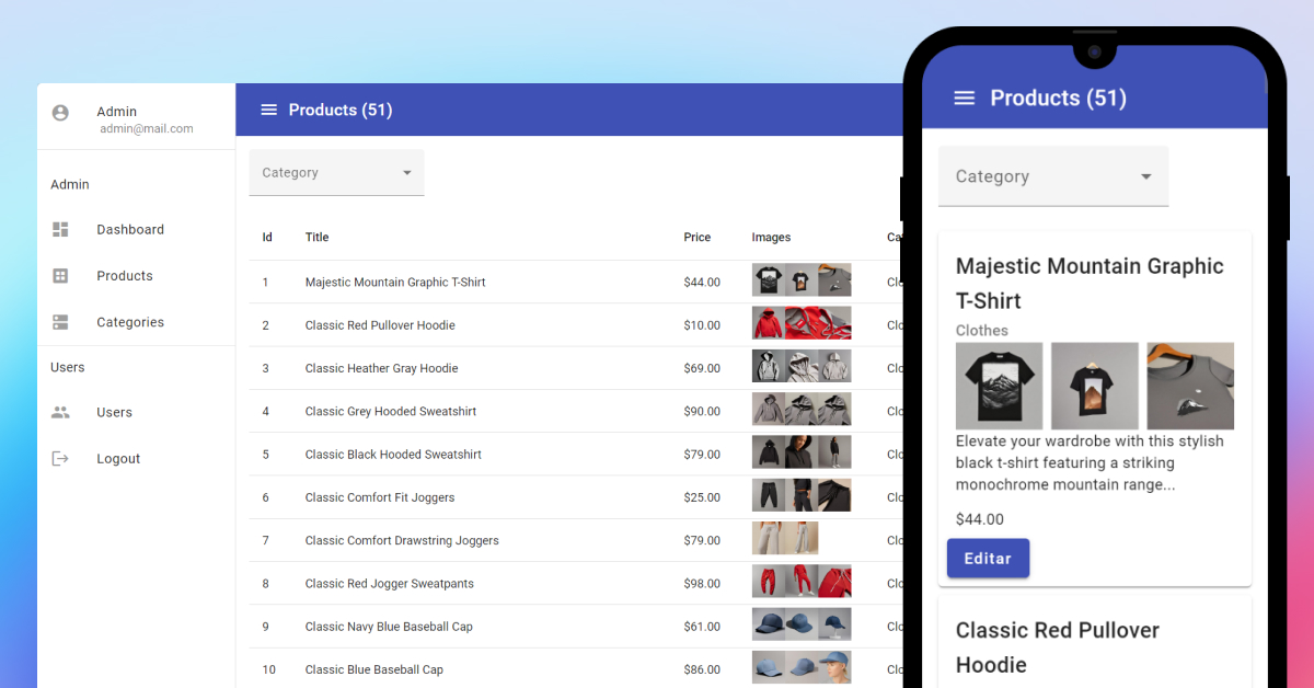
This pattern consists of creating different components and loads depending on the screen size; for example, on a desktop screen, there is a specific component with a table.
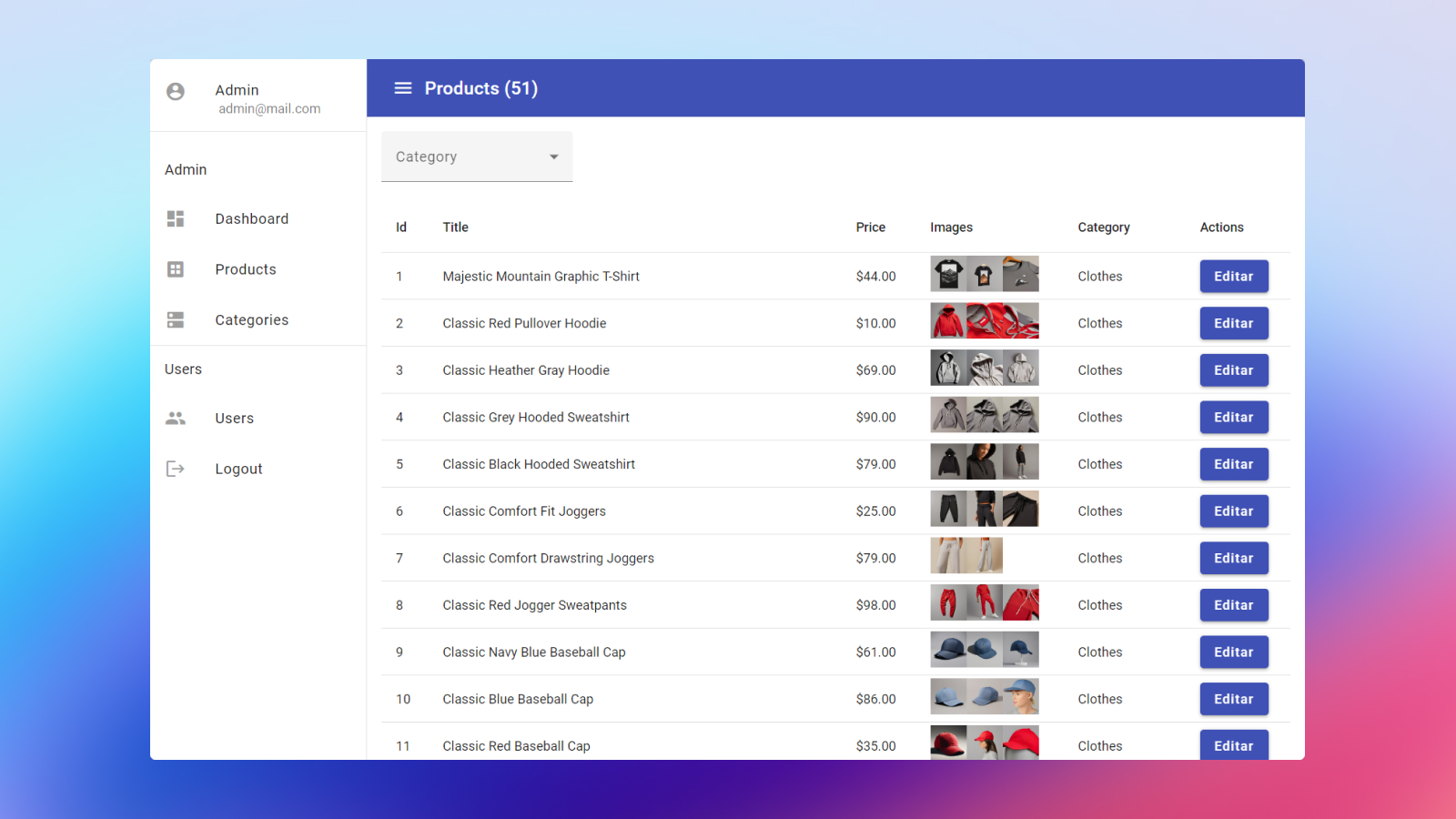
And when the app runs on mobile screens, the app loads a different component based on cards.
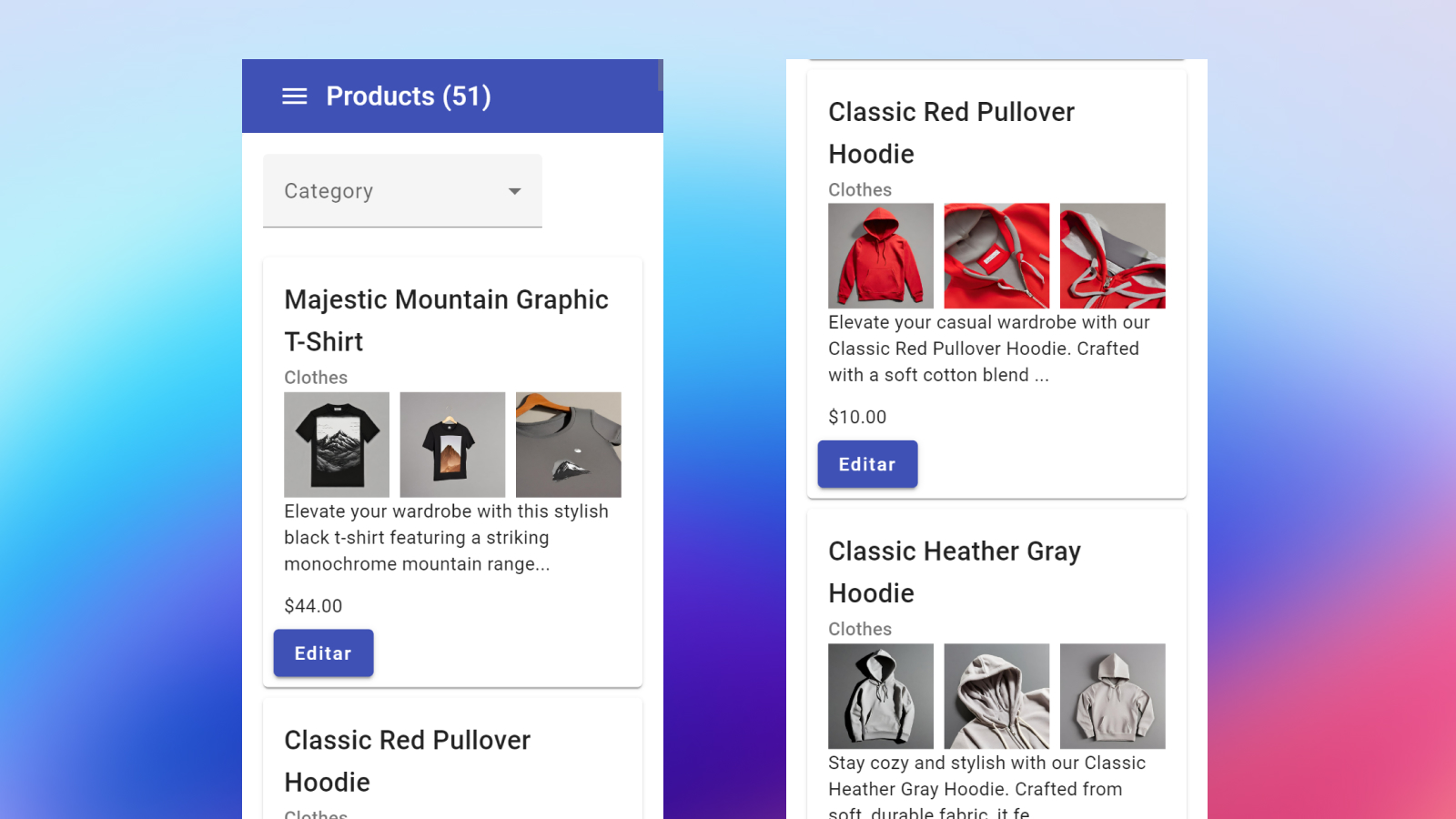
This approach is simple because you can have two different components, one for mobile and another for tablets or desktops. The advantage of this approach is that you can create a customized view on mobile or other screens; the disadvantage is that you have components with similar logic, but this is a trade-off for this approach.
It basically works by depending on isMobile signal to detect if it is mobile or not.
@if (isMobile()) {
  <app-list [products]="products()" />
} @else {
  <app-table [products]="products()" />
}
When the app detects a mobile device, it loads a specific component; otherwise, it loads a different component, note that both use the same input. The isMobile signal uses the Angular CDK’s BreakpointObserver to detect when it is mobile.
import { BreakpointObserver, Breakpoints } from '@angular/cdk/layout';
import { toSignal } from '@angular/core/rxjs-interop';
import { map } from 'rxjs/operators';

export default class ProductsComponent {
  private breakpointObserver$ = inject(BreakpointObserver);
  private isMobile$ = this.breakpointObserver$
    .observe(Breakpoints.Handset)
    .pipe(
      map((result) => result.matches)
    );

  isMobile = toSignal(isMobile$, { initialValue: true });

}
Yes, I know that this task is possible using CSS Media Queries like this:
@media screen and (min-width: 0px) and (max-width: 400px) {
  #my-content { display: block; }  /* show it on small screens */
}

@media screen and (min-width: 401px) and (max-width: 1024px) {
  #my-content { display: none; }   /* hide it elsewhere */
}
But in this case, you actually load both components and just hide them from the user’s view with CSS.
Using defer block to save bytes
With this approach, it is possible to use the new defer block to save bytes and load the component only when needed. With this code:
@if (isMobile()) {
  @defer {
    <app-list [products]="products()" />
  }
} @else {
  @defer {
    <app-table [products]="products()" />
  }
}
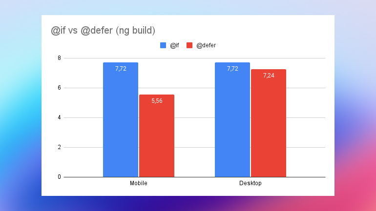
Now, with this approach, it is possible to save bytes depending on isMobile signal, because when you use the @if approach, both components are loaded in the page, but when you use the defer component, each component is loaded only when it is needed.
To visualize this case, when using the @if approach, you include both components in the page with a size of 7.72 kb.
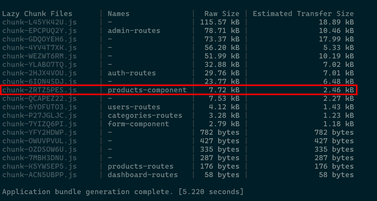
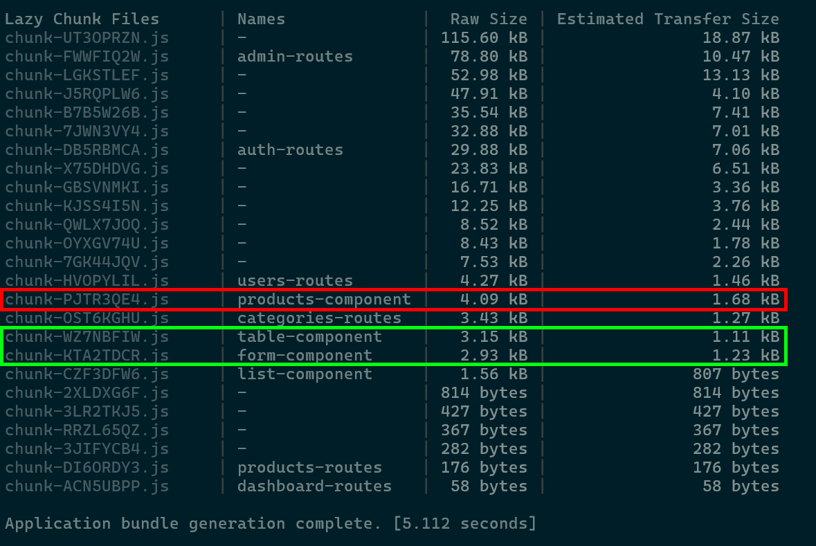
But if you use the defer approach, the component is split into three chunks:
| Component | Size |
|---|---|
| products-component (The page itself) | 4.09kb |
| list-component | 1.56kb |
| table-component | 3.15kb |
In the mobile case, the products-component and list-component are loaded, resulting in a total of 5.56kb loaded. Conversely, if it is not a mobile device such as a tablet or desktop, the product-component and table-component are loaded, resulting in a total of 7.24kb.
As a result, in mobile environments, the view loads with fewer KBs, saving data, and the desktop loads the table component as needed.
And it makes sense because the table component uses more dependencies, like a MatTableModule to render the table, and the list component is just a way of using a MatCardModule to have a responsive table and reduce the size depending on whether it is mobile or not.